
Jon Anderson Political Campaign
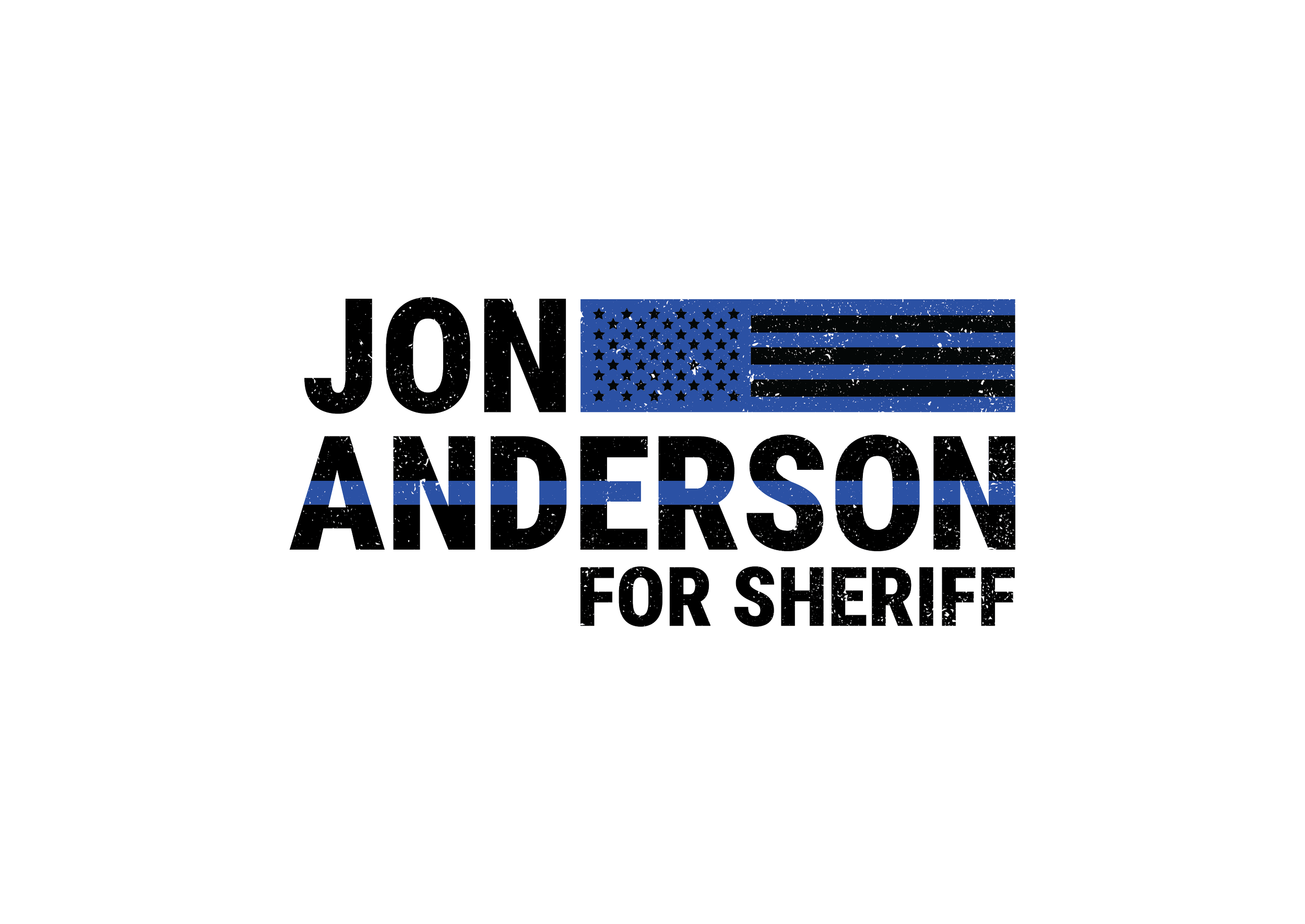
Jon is a principled and highly experienced candidate for Sheriff. He envisioned a logo that is strong, patriotic, and incorporates "thin blue line" symbolism without relying on common sheriff candidate tropes like a large badge or shield.
For his final logo, I selected a robust, heavy font and used a partial American flag to balance his shorter first name with his longer last name. I integrated a blue line through his last name, a subtle nod to the "thin blue line" without being overly obvious. The full logo includes a box that unifies the design elements with his slogan, "community, safety, freedom," and features small sheriff stars as a subtle reference to his candidacy without being too prominent. To add a unique touch, I overlaid a rugged texture across the entire logo, highlighting his real-world experience and distinguishing him from smooth career politicians.
-
![Jon Anderson for Ottawa County Sheriff Logo Design]()
Full Logo
-
![Jon Anderson for Ottawa County Sheriff Alternative Logo]()
Alternative Logo


As the sole designer for Jon's campaign, I personally created a variety of marketing materials to help him succeed. These included t-shirts, parade banners, yard signs, a website, name badges, mailers, doorknockers, and even a 22’x10’ graphic for a large campaign truck. Each of these items adhered to Jon's brand identity, often featuring a rugged, gray, concrete texture to create a cohesive and distinctive look across all his marketing materials.
Want to see more of my political campaign designs? Click here for more!