Joshua House Branding and Logo Project
For this project, I developed a comprehensive brand identity for Joshua House, an organization that equips the Church to engage culture through discipleship, fatherhood advocacy, leadership networks, and Gospel-centered consulting. Their mission is rooted in helping Christians live with bold, missional faith at the intersection of Church and culture.
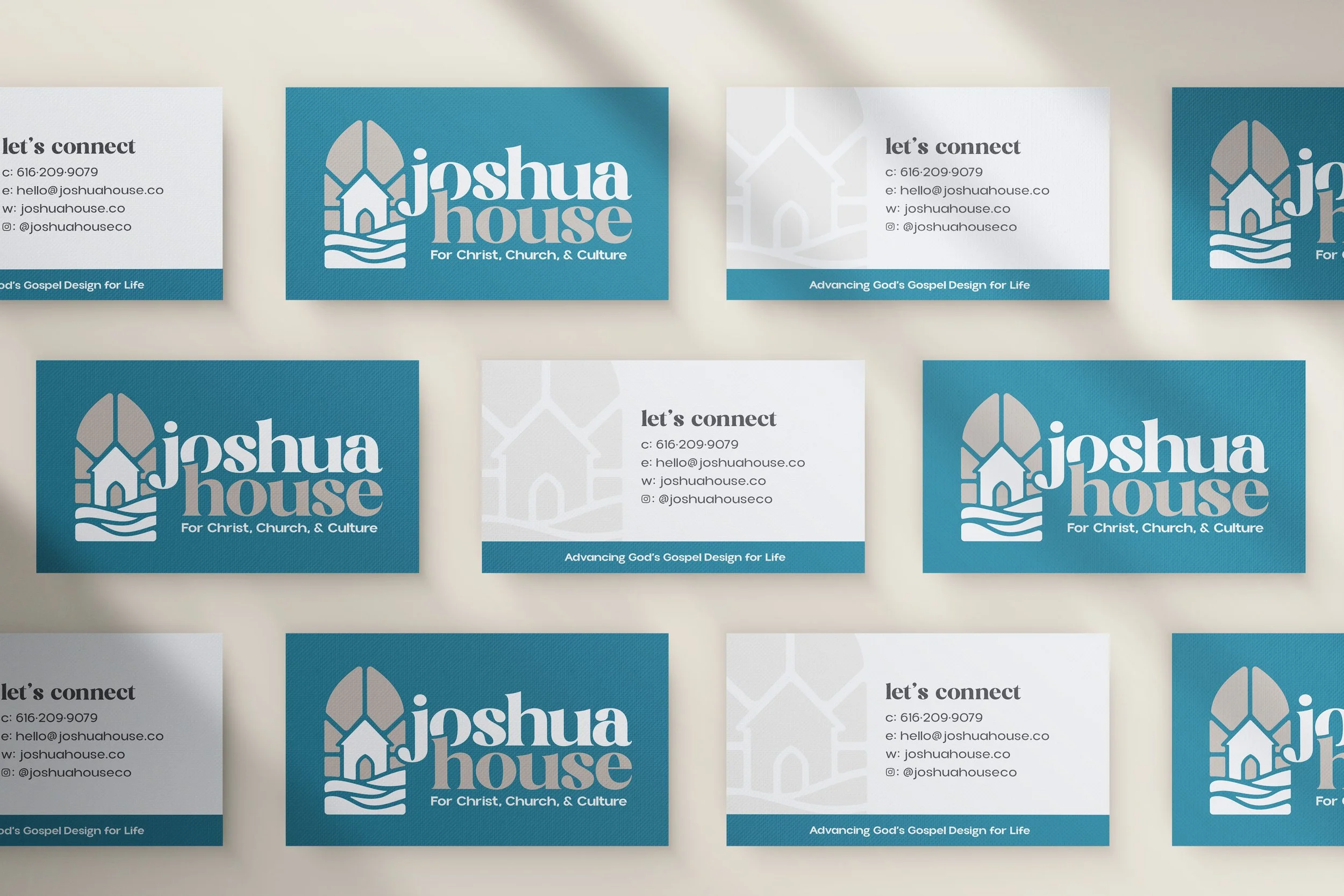
The logo design was crafted to visually express this mission through deep biblical and symbolic meaning:
Stained Glass Shape: The entire icon takes the form of a stained glass window, reflecting the Church as both a spiritual sanctuary and a beacon of light.
House Icon at the Center: Represents the early Church, which often met in homes. This underscores Joshua House’s emphasis on family, foundation, and relational discipleship.
12 Pieces: The whole icon is made from twelve pieces symbolizing the twelve stones placed by Israel after crossing the Jordan (Joshua 4). This symbolizes remembrance, covenant, and legacy.
Flowing Lines: Represent the Jordan River, capturing themes of crossing into promise, obedience, and transformation.
Ray Shapes: The shapes pointing outward signify the Great Commission, going out to make disciples.
The final brand system paired this icon with a typeface that balances playfulness and tradition. Its youthful curves bring energy and approachability, while subtle serif touches maintain a sense of trust, stability, and heritage without looking stuffy.
This identity provides Joshua House with a visual foundation that is not only aesthetically consistent but also spiritually resonant. It communicates depth, clarity, and purpose across all touchpoints.
In addition to brand design, I created a business card that reflects the themes of the logo. I utilized the full color inverse logo design for the front on the bold blue background and then carried over font choices and a subtle icon overlay for the back.